Tổng hợp bài mẫu IELTS Writing Task 1 - Academic
Tổng hợp bài mẫu IELTS Writing Task 1 - Academic
Thí sinh thi IELTS được khuyến cáo rằng chỉ nên dành 20 phút cho bài IELTS writing task 1, và đây cũng có thể nói là bài "kiếm điểm" cho họ. Tuy nhiên, không phải ai cũng đạt được điểm số cao cho bài này vì chưa biết phân tích câu hỏi, tìm ý cũng như trình bày các ý một cách hiệu quả. Vậy hôm nay, VnDoc.com sẽ giúp bạn biết được cách viết bài qua tài liệu Tổng hợp bài mẫu IELTS Writing Task 1.
IELTS Writing Task 1: Viết General Statement cho Line Graph
The Writing Task 1 of the IELTS Academic test requires you to write a summary of at least 150 words in response to a particular graph (bar, line or pie graph), table, chart, or process (how something works, how something is done). This task tests your ability to select and report the main features, to describe and compare data, identify significance and trends in factual information, or describe a process.
1. You should spend about 20 minutes on this task.
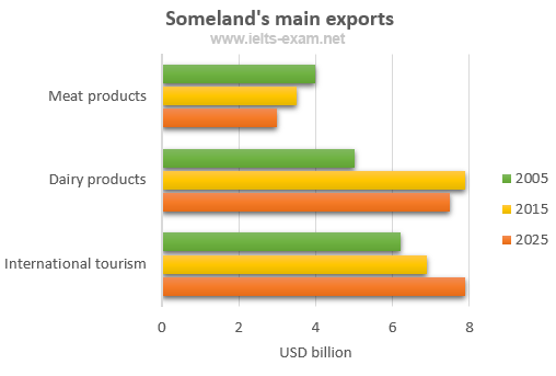
The chart below gives information about Someland's main exports in 2005, 2015, and future projections for 2025.
Summarise the information by selecting and reporting the main features, and make comparisons where relevant.
Write at least 150 words.
Model answer
This bar chart illustrates the performance of Someland's primary exports in 2005 and 2015. It also indicates future projections for 2025. According to the data, it seems likely that international tourism will become the dominant industry, although dairy exports will remain strong. In 2005, we can see that tourism was the greatest exports earner of the three industries, with revenue standing at just over $6 billion.
This figure has increased slightly, so that now, in 2015, it has reached almost $7 billion. It is estimated that international tourism will continue to grow, so that by 2025, it will be earning around $8 billion for the country. In 2000, dairy exports were worth around $5 billion, but since then there has been a dramatic increase, and sales for this year are approximately $8 billion. Experts are predicting that exports in this area may fall slightly, so a figure of $7.5 billion is expected for 2025. Meat products are the third key industry in Someland, but sales have dropped since 2000 and now stand at $3.5 billion. It is expected that sales will continue to decrease in the future.
(187 words)
2. You should spend about 20 minutes on this task.
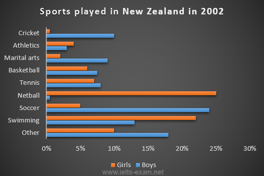
The chart below gives information about the most common sports played in New Zealand in 2002.
Summarise the information by selecting and reporting the main features, and make comparisons where relevant.
Write at least 150 words.
Model answer
The bar graph provides information about the most Common sports played in New Zealand in 2002. It gives figures for both boys and girls and clearly shows that their participation in sports is fairly equal. However, their sporting preferences tend to be different.
According to the graph, the most popular sport among girls is netball, with participation rates reaching 25 per cent. A similar percentage of boys prefer soccer, which is clearly their favourite sport. Ten per cent of boys also enjoy playing cricket but hardly any girls take part in this game. While swimming is popular among both boys and girls, fewer boys participate in this sport - about 13 per cent compared to approximately 22 per cent of girls.
Other sports such as tennis, basketball and martial arts have lower levels of popularity, and a significant percentage of boys and girls say they enjoy sports not referred to on the chart.
(153 words)
3. You should spend about 20 minutes on this task.
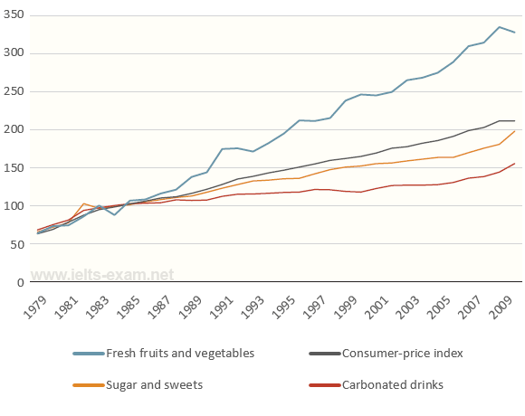
The graph below shows relative price changes for fresh fruits and vegetables, sugars and sweets, and carbonated drinks between 1978 and 2009.
Summarise the information by selecting and reporting the main features, and make comparisons where relevant.
Write at least 150 words.
Model answer
The graph shows changes in the price of fresh fruits and vegetables, sugar and sweets, and carbonated drinks over a thirty-year period in the US between 1979 and 2009. The graph also shows the general trend in the consumer price index during this time.
While the consumer price index showed a slow and steady increase from 1979 to 2009, the same cannot be said for the price of carbonated, or soft drinks. After rising briefly between 1979 and 1981, they remained fairly constant until 1999, when the price did begin to increase slowly.
In contrast, there was a marked difference in the price of fresh fruits and vegetables, which, despite periodic fluctuations, rose steadily throughout this period. In fact, fresh food prices only levelled out temporarily between 1990 and 1992 and again from 2000 to 2001. However, by 2008 the price had increased by more than 300%.
4. You should spend about 20 minutes on this task.
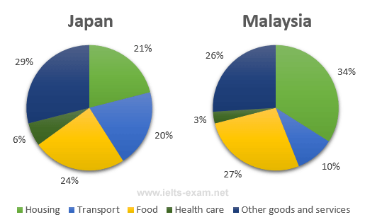
The pie charts below show the average household expenditures in Japan and Malaysia in the year 2010.
Summarise the information by selecting and reporting the main features, and make comparisons where relevant.
Write at least 150 words.
Model answer
The pie charts show the proportion of money spent on various household expenses in Malaysia and Japan in 2010.
We can see that in Malaysia the greatest proportion of expenditure (34%) was on housing, while in Japan housing accounted for just 21% of the total. In contrast, in Japan the greatest single expense was other goods and services at 29%, compared with 26% in Malaysia. Food came in second place in Japan, at 24%, while in Malaysia the actual proportion was higher (27%). In Japan another major expense was transport, at 20%, but this was much lower In Malaysia (10%). In both countries the smallest percentage of expenditure was on health care.
Overall, the data indicates that in both cases food, housing and other goods and services were the main expenses, but that in Japan, transport and other goods and services took up a higher proportion of total expenditure than in Malaysia.
5. You should spend about 20 minutes on this task.
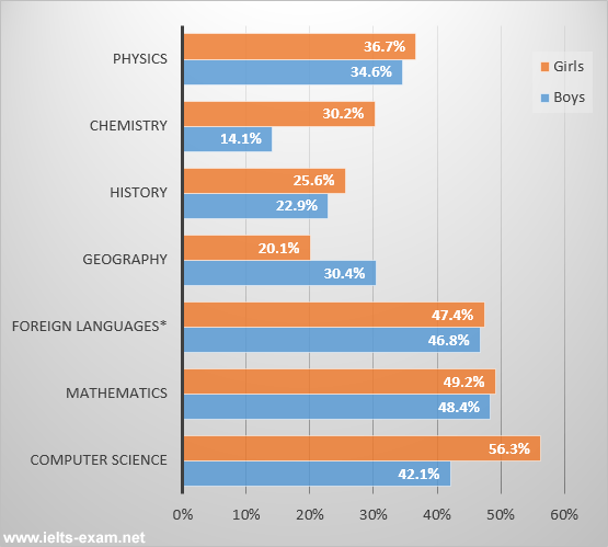
The bar chart below shows the percentage of students who passed their high school competency exams, by subject and gender, during the period 2010-2011.
Summarise the information by selecting and reporting the main features, and make comparisons where relevant.
Write at least 150 words.
Model answer
The graph shows the percentages of boys and girls who were successful in their high school competency exams in the period from 2010 to 2011, by subject.
Overall, students of both sexes did/performed best in Computer Science, Mathematics, and Foreign Languages, including French, German and Spanish. Results for boys and girls were roughly comparable/equivalent/equal/the same in Computer Science and Mathematics. In other subjects, however, there were some significant differences.
Girls achieved by far their best results in Computer Science, with a pass rate of 56.3%, which was considerably/much/around 14% higher than the boys. The difference was even greater/more marked in Chemistry, where over/more than 16% more girls passed. The (only/one/single) subject where boys' results were better than girls was Geography where they achieved a pass rate of 30.4%, which was 10% higher than that/the figure/the percentage/the pass rate/the result for girls.
In general, we can (say/see)/the statistics show that during the period in question girls performed better in most subjects in the competency exams than boys.
6. You should spend about 20 minutes on this task.
The table below shows the worldwide market share of the notebook computer market for manufacturers in the years 2006 and 2007.
Summarise the information by selecting and reporting the main features, and make comparisons where relevant.
Write at least 150 words.
|
Company |
2006 % Market Share |
2007 % Market Share |
|
HP |
31.4 |
34 |
|
Dell |
16.6 |
20.2 |
|
Acer |
11.6 |
10.7 |
|
Toshiba |
6.2 |
7.3 |
|
Lenovo |
6.6 |
6.2 |
|
Fujitsu-Siemens |
4.8 |
2.3 |
|
Others |
22.8 |
19.3 |
|
Total |
100 |
100 |
The table gives information on the market share of notebook computer manufacturers for two consecutive years, 2006 and 2007.
In both years, HP was clearly the market leader, selling 31.4% of all notebook computers in 2006, and slightly more (34%) in 2007. This is a greater market share than its two closest competitors, Dell and Acer, added together.
Dell increased its market share from 16.6% in 2006 to 20.2% in 2007. In contrast, Acer saw its share of the market decline slightly from 11.6% to 10.7%.
The other companies listed each had a much smaller share of the market. Toshiba's share increased from 6.2% in 2006 to 7.3% in 2007, whereas Lenovo's decreased slightly from 6.6% to 6.2%. Fujitsu-Siemens' share more than halved from 2006 to 2007: from 4.8% of the market to only 2.3%.
Other notebook computer manufacturers accounted for 22.8% of the market in 2006 – more than all the companies mentioned except HP. However, in 2007 the other companies only made 19.3% of notebook computer sales – less than both HP and Dell.
(174 words)
7. You should spend about 20 minutes on this task.
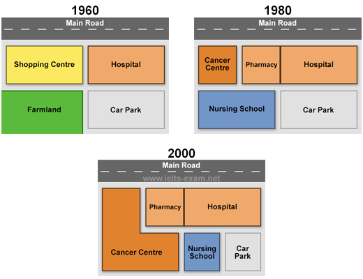
The diagrams below show the changes that have taken place at Queen Mary Hospital since its construction in 1960.
Summarise the information by selecting and reporting the main features, and make comparisons where relevant.
Write at least 150 words.
Model answer
The diagrams show Queen Mary Hospital at three different stages in its development: 1960, 1980 and 2000.
In 1960, the hospital was built close to a main road and next to a shopping centre. A large area behind the hospital was turned into a car park, while the area behind the shopping centre was farmland.
By 1980, the shopping centre had been demolished in order to make way for two additional hospital building which became a pharmacy and a cancer centre. Furthermore, the hospital gained the farmland and converted it into a nursing school.
In 2000, the main hospital building remained unchanged but the cancer centre was extended to cover the entire nursing school. As a result of this, the original car park was divided into two so that it provided a smaller car park and a small nursing school.
During this period, the hospital has increased in size and, in addition to a new nursing school, a cancer centre has been created and extended. Hence the capacity of the car park has been reduced by a half.
(178 words)
8. You should spend about 20 minutes on this task.
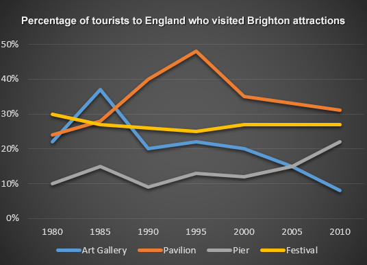
The line graph below shows the percentage of tourists to England who visited four different attractions in Brighton.
Summarise the information by selecting and reporting the main features, and make comparisons where relevant.
Write at least 150 words.
Model answer
The line graph shows the percentage of tourists to England who visited certain Brighton attractions between 1980 and 2010. We can see that in 1980 and in 2010 the favourite attractions were the pavilion and the festival. In 1980 the least popular attraction was the pier but in 2010 this changed and the art gallery was the least popular.
During the 1980s and 1990s there was a sharp increase in visitors to the pavilion from 28% to 48% and then the percentage gradually went down to 31% in 2010. The trend for the art gallery was similar to the pavilion. Visitors increased rapidly from 22% to 37% from 1980 to 1985 then gradually decreased to less than 10% over the next twenty-five years. The number of tourists who visited the Brighton Festival fluctuated slightly but in general remained steady at about 25%. Visitors to the pier also fluctuated from 1980 to 2000 then rose significantly from 12% to 22% between 2000 and 2010.
(163 words)