Tổng hợp đề và bài mẫu IELTS writing dạng Pie charts
Tổng hợp đề và bài mẫu IELTS writing dạng pie chart
Thí sinh thi IELTS được khuyến cáo rằng chỉ nên dành 20 phút cho bài IELTS writing task 1, và đây cũng có thể nói là bài "kiếm điểm" cho họ. Tuy nhiên, không phải ai cũng đạt được điểm số cao cho bài này vì chưa biết phân tích câu hỏi, tìm ý cũng như trình bày các ý một cách hiệu quả. Vì vậy, VnDoc.com đưa ra các bài mẫu về pie charts giúp bạn không bị mất điểm phần này.
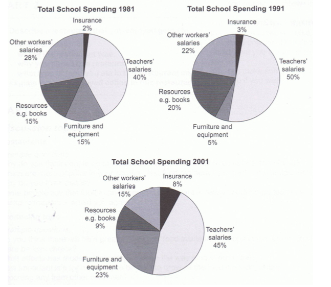
1. The three pie charts below show the changes in annual spending by a particular UK school in 1981, 1991 and 2001.
Summarize the information by selecting and reporting the main features, and make comparisons where relevant.
Answer:
The pie charts compare the expenditure of a school in the UK in three different years over a 20-year period.
It is clear that teachers' salaries made up the largest proportion of the school's spending in all three years (1981, 1991 and 2001). By contrast, insurance was the smallest cost in each year.
In 1981, 40% of the school's budget went on teachers' salaries. This figure rose to 50% in 1991, but fell again by 5% in 2001. The proportion of spending on other workers' wages fell steadily over the 20-year period, from 28% of the budget in 1981 to only 15% in 2001.
Expenditure on insurance stood at only 2% of the total in 1981, but reached 8% in 2001. Finally, the percentages for resources and furniture/equipment fluctuated. The figure for resources was highest in 1991, at 20%, and the proportion of spending on furniture and equipment reached its peak in 2001, at 23%.
Sample Answer 1:
The given pie charts give information on the spending of a UK school in three different years with the 10 years interval starting from 1981.
According to the given data, in 1981 the UK school's 40% expense was for teacher's salary while 15% expenses were both for the school equipment and for other resources like book. 2% of it expenses was made for the insurance and remaining 28% was for the other staff's salary. After 10 years the expenses in teachers' salary increased by10% while the expenses on school furniture reduced by 10%. Resources and books related expenses increased by 5% while other staffs' salary decreased by 6% this year. Only one percent expenses increased for the insurance.
In 2001, the expense of this school in this year was 45% for the teachers. The insurance cost increased to 8% while the furniture related expenses increased to 23% and staff salary and resource purchasing expenses decreased to 15% and 9% respectively.
Sample Answer 2:
A glance at the three given graphs reveals some differences among the expenditures per year of a British school in a period of three years: 1981, 1991, 2001.
Overall, it can be seen that there are many trends that are obviously illustrated in those charts: upward, downward and both upward and downward. The changes of those features can be divided into two main groups on account of their trends: single trend and couple trends group.
Starting with the first group, insurance and other workers' salaries, in 1981, the insurance only took two percent of total, however, in twenty years later, the number experienced a considerable growth of six percent to eight percent. Unlike the insurance, the salaries of other workers witnessed a respective drop from approximately thirty percent to a mere fifteen percent in about twenty years.
Moving on to the second group, we can see that both teachers-salaries' and resources' proportions significantly fluctuated. In the first ten years of the period, the numbers rose five and ten percent to reach fifty and twenty percent, however, slipped dramatically in the next years from fifty to forty five and from twenty to a mere nine percent. In contrast, furniture and equipment spending first experienced a decrease and then quickly climbed from five percent in 1991 to twenty percent, a growth of eighteen percent.
It is interesting to note that through approximately twenty years, the total spending on different things of this UK school changed considerably.
2. You should spend about 20 minutes on this task.
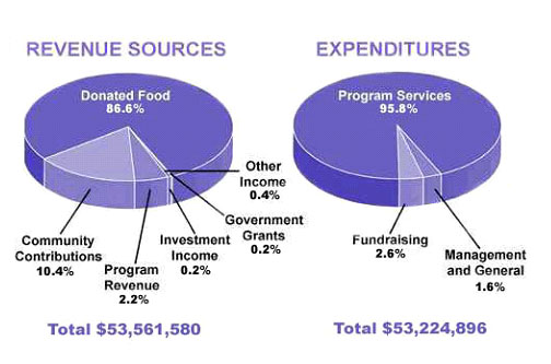
The pie chart shows the amount of money that a children's charity located in the USA spent and received in one year. Summarize the information by selecting and reporting the main features and make comparisons where relevant. Write at least 150 words
Model Answer
The pie charts show the amount of revenue and expenditures over a year of a children's charity in the USA. Overall, it can be seen that donated food accounted for the majority of the income, while program services accounted for the most expenditure. Total revenue sources just exceeded outgoings.
In detail, donated food provided most of the revenue for the charity, at 86%. Similarly, with regard to expenditures, one category, program services, accounted for nearly all of the outgoings, at 95.8%.
The other categories were much smaller. Community contributions, which were the second largest revenue source, brought in 10.4% of overall income, and this was followed by program revenue, at 2.2%. Investment income, government grants, and other income were very small sources of revenue, accounting for only 0.8% combined.
There were only two other expenditure items, fundraising and management and general, accounting for 2.6% and 1.6% respectively. The total amount of income was $53,561,580, which was just enough to cover the expenditures of $53,224,896.
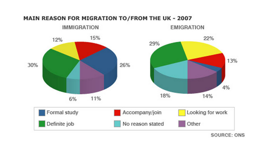
3. You should spend about 20 minutes on this task. The pie charts show the main reasons for migration to and from the UK in 2007. Summarize the information by selecting and reporting the main features and make comparisons where relevant. Write at least 150 words.
Answer:
The pie charts illustrate the primary reasons that people came to and left the UK in 2007. At first glance it is clear that the main factor influencing this decision was employment.
Having a definite job accounted for 30 per cent of immigration to the UK, and this figure was very similar for emigration, at 29%. A large number of people, 22%, also emigrated because they were looking for a job, though the proportion of people entering the UK for this purpose was noticeably lower at less than a fifth.
Another major factor influencing a move to the UK was for formal study, with over a quarter of people immigrating for this reason. However, interestingly, only a small minority, 4%, left for this.
The proportions of those moving to join a family member were quite similar for immigration and emigration, at 15% and 13% respectively. Although a significant number of people (32%) gave 'other' reasons or did not give a reason why they emigrated, this accounted for only 17% with regards to immigration.
173 words
4. You should spend about 20 minutes on this task.
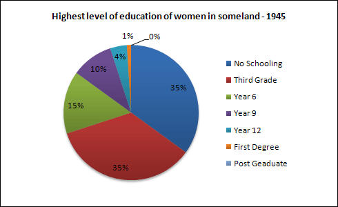
Write a report for a university lecturer describing the information in the graphs below.
Write at least 150 words.
Sample answer 1
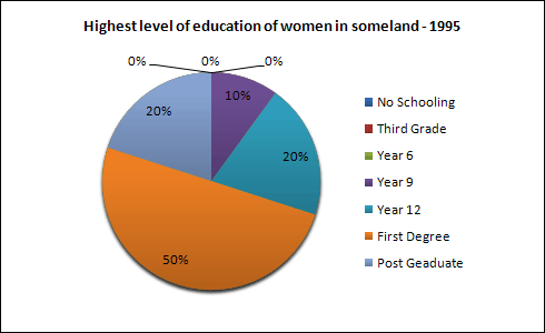
The pie charts compare the highest level of education achieved by women in Someland across two years, 1945 and 1995. It can be clearly seen that women received a much higher level of education in Someland in 1995 than they did in 1945.
In 1945 only 30% of women completed their secondary education and 1% went on to a first degree. No women had completed post-graduate studies. This situation had changed radically by 1995. In 1995, 90% of women in Someland had completed secondary education and of those, half had graduated from an initial degree and 20% had gone on to postgraduate studies. At the other end of the scale we can see that by 1995 all girls were completing lower secondary, although 10% ended their schooling at this point. This is in stark contrast with 1945 when only 30% of girls completed primary school, 35% had no schooling at all and 35% only completed the third grade.
In conclusion, we can see that in the 50 years from 1945 to 1995 there have been huge positive developments to the education levels of women in Someland.
5. Write a report for a university lecturer describing the information below.
» You should write at least 150 words.
» You should spend about 20 minutes on this task.
Sample Answer 1:
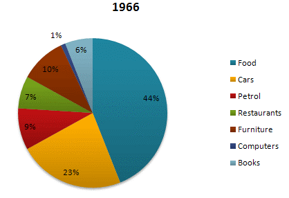
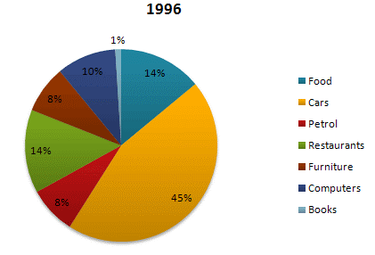
The pie charts compare the expenditure of US residents in two different years for seven categories namely food, cars, petrol, restaurants, furniture, computers and books.
It is clear that, the largest proportion of American citizens' spending went on foods and cars. On the other hand, computers and books have the lowest percentage in the chart in 1966 and 1996 respectively.
In 1966, 23% of American citizens' expenditure went on cars. The percentage rose to nearly double, at 45% in 1996.The proportion of spending on food fell from 44% in 1966 to only 14% in 1996.
Expenditure on computers stood at only 1% in 1966, but reached 10% in 1996. The percentage of American citizens spending on restaurants had doubled from 7% in 1966 to 14% in 1996. Spending on books was highest in 1966, at 6%. By contrast, there was no significant change in the proportions of petrol and furniture over a period as a whole.
(Approximately 156 words | by - Safa Ahmed )
Sample Answer 2:
The pie charts show changes in American spending patterns between 1966 and 1996.
Food and cars made up the two biggest items of expenditure in both years. Together they comprised over half of household spending. Food accounted for 44% of spending in 1966, but this dropped by two thirds to 14% in 1996. However, the outlay on cars doubled, rising from 23% in 1966 to 45% in 1996.
Other areas changed significantly. Spending on eating out doubled, climbing from 7% to 14%. The proportion of salary spent on computers increased dramatically, up from 1% in 1996 to 10% in 1996. However, as computer expenditure rose, the percentage of outlay on books plunged from 6% to 1%.
Some areas remained relatively unchanged. Americans spent approximately the same amount of salary on petrol and furniture in both years.
In conclusion, increased amounts spent on cars, computers, and eating out were made up for by drops in expenditure on food and books.
(Approximately 159 words)